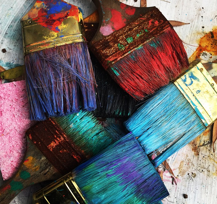
The importance of generating the right atmosphere in your workspace is paramount. Colour plays a monumental role in this. Every single colour and every single shade is associated with certain feelings. They work to create the said vibe in a certain area. Colour psychology in the workplace is something you can use to your advantage.
If you pick your office’s colour palette carefully then you can create an atmosphere which is productive, inspirational, and altogether positive. However, if you choose the colours badly, then you can easily create a headache-inducing and frustrating working environment. It is fair to say that this is the last thing you want to happen.
Unfortunately, there is no magic formula. There is no one colour that is going to make your business a productive space. If there was, then everybody would be using it! It depends on the industry you are involved in and the service you provide. For instance, if you work in an environment whereby you need to create a calming environment – such as psychiatrist’s clinics and spas – then when carrying out an office fitout, you must go for colours that allow you to generate this atmosphere. Pale shades of blue and green work to create a peaceful vibe. You definitely want to stay away from bold, bright and harsh colours.

Nevertheless, these are obviously very uniques example and not all businesses have a specific environment they need to generate. For instance, there is no specific colour relating to IT offices. However, there are moods you would prefer to create i.e. positivity, friendliness, productiveness and alike. So, let’s look into a few shades in a bit more depth. This should help you to determine which would be good for you.
- Red – Red is extremely effective in the workplace, yet only when it is being used as an accent, not an overall colour. It increases brain activity and stimulates employees. However, if it is in its plentiful it can be too harsh and linked to feelings of annoyance. Your employees will struggle to think freely if they are working in an office that is predominantly red. Instead, use it in small doses. Red also works well in a retail environment to create a sense of urgency.
- Yellow – Yellow is a cheery colour. However, it should be used with caution. It can cause irritation to your employees because of its brightness. However, if you use it strategically and in small amounts it can really enhance creative thinking. It should be used in offices whereby the arts, innovation, and creativity are at the core.
- Blue – Blue is an extremely professional shade and it is used in order to enhance productivity. It is also associated with lowering heart rates and blood pressure. If you want to create a calming environment that enables people to work to their best, blue is a good option to go for.
- Orange – Orange is linked with enthusiasm and inspiration. You do need to be careful with the shade you select. Similarly to yellow this can be harsh on the eyes.
- Pink – Pink is rarely used in the office because it is too relaxed and cosy. However, there are instances whereby this may be applicable, depending on the industry.
- Green – Green creates a feeling of relaxation. One of the great things about the colour is the fact that it actually helps to give the eyes some rest. Therefore, this is ideal in offices whereby people spend all of their days at the computer. It is also a colour that is associated with health and the environment.
So there you have it; an insight into the use of colour psychology in the workplace. What shade will you be going for? Don’t take for granted just how important it is to choose the colour used in your office with care. The shades you go for will have a massive impact on the overall mood and feel in the workplace, helping to create a productive and inspiring environment – if you get it right, of course. If you get it wrong, you can expect the design of your office to prevent everyone from achieving their best, rather than helping them to do so.