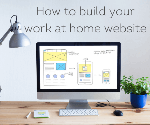

Many people are keen to make an extra income from blogging, or to even replace their full time salary from the income they generate from their blog – yet, creating a good website is a lot trickier than many people think.
Whether it’s a website to house the blog you are starting or a more typical small (or large) business, the metrics of what makes a good website good are much more than fancy images and graphics.
Indeed, today, in business it’s much less about whether you have a nice looking website and more about whether you have a “high converting” website; meaning a website that converts browsers into buyers, or as they say in the travel industry, lookers into bookers!
The challenge is that people all have a subjective idea of what makes a design good, and whilst there is a science to this process, you’ll probably only benefit from that science if you work with a professional web design company rather than attempt to do it yourself.
In fact, if you are planning to do the website yourself you are going to fall into one of two broad groups; the first group tend to be blissfully ignorant in terms of their lack of awareness of what makes a good website good, whilst the second group tend to be paralysed in a state of overwhelm by trying to research and learn everything they need to know in order to make their website “good”.
There’s a lot of content and advice out there, and it can be easy to get lost in what makes a good website good – which is why, in this article, we’re going to focus on three core aspects that are fundamental to any “good” website.
SPEED
Load times are critically important when it comes to websites, as research shows that if your website hasn’t fully loaded within three seconds people will simply leave. You therefore want to make sure there are as few requests on the server as possible and minimise the size of files, such as images, using tools to compress JPEGS for instance.
CONTENT ARCHITECTURE
You want people to land on your home page and be able to find what they are looking for very quickly and effortlessly. This requires you chunk things into appropriate categories and think of different pages of your website as offering different levels of depth in terms of content.
For instance, if we think of a university website, the first level of content might just be a listing of Course A. Then, when you click on Course A it might take you to a landing page that offers a basic overview, with some tabs for further information – which, you click on and find out in depth information that’s specifically of relevance to your interests.
In this sense, you want information to cascade and be revealed in different stages; as otherwise, you’ll end up overloading people with information.
DESIGN
The design aesthetic of your website is important, as if you have a very fast loading website with an easy to navigate content architecture, but it’s horrible to look at – you’re not going to get many users want to engage with your site.
You therefore want to focus on creating a pleasant design that’s easy on the eye, and is build around highlighting your core content – meaning it needs to be relatively minimalist rather than crammed full with colourful banners and boxes all fighting for your attention; in a nutshell, there needs to be a clear visual hierarchy so that users know where to focus their attention first.
The simplest way to explain the concept of visual hierarchy is to consider a blog post that has large text for the title, medium text for the intro paragraph hooking people into the content, then small text for the body of the blog post.